How to browse this table
Properties, filters, and settings listed below apply for all Dashboard widgets in both Personal Dashboards and Non-Personal Dashboards.
💡Tipps and Tricks:
- Many widgets share concepts (e.g. filtering, thresholds), so the the table below is sorted by common properties, alphabetically.
- This table is large. When you view this page standalone, use the Table of Contents on the right-hand side to navigate.
- You can use CTRL+F to search for particular elements matching to the Nimbus UI.
| Property | Dashboard widgets using this property | Description / Usage tips | ||||||||
|---|---|---|---|---|---|---|---|---|---|---|
Avatar |
|
Picture of the user, as defined in the Tenant's user directory. Also shows the → Presence State as a small colored dot. | ||||||||
Background Color |
|
A choice of background colors. 💡The font color inverts automatically to increase contrast on bright colors. |
||||||||
Colors (Value thresholds) |
|
Colors can be applied:
On Heatmaps the colors are fixed as follows:
🔎 Also see → Thresholds. |
||||||||
Columns |
|
💡 To reorder, drag and drop the entries During Edit Mode you can do the following:
|
||||||||
Content |
|
Uses → Markdown language to show content of your choice. Supported features are:
☝ Unsupported extended Markdown Syntax may work, but break the widget layout. |
||||||||
Controls |
|
🔍This column relates exclusively to Supervision widgets. ✅ You require "Supervisor" User Roles to use the controls. Refer to Dashboard Supervision for details. |
||||||||
Data Source |
|
☝ Attention: Your previous data source selection is removed when switching between options below. If you need to filter with different sources (e.g. specific users and Organization Units), create two separate widgets instead. Select a type of data source with the following options:
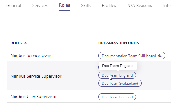
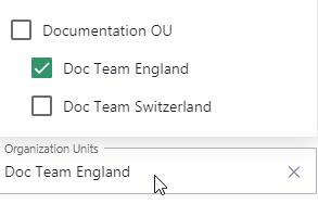
Organization Units - ✅ SUPERVISOR Role: You require a Service / User Supervisor role granted for the corresponding Organization Unit to see entries. Also see → User Administration > Roles tab.
|
||||||||
Date and Time (widget) |
|
Note: Properties below are unique to the "Current Date and Time" widget:
|
||||||||
Due Date |
|
Limit the list of scheduled Outbound Call tasks that only match the due date criteria. 🔍 Outbound tasks are created and manipulated via Flow Actions of the Microsoft Power Automate Connector. |
||||||||
Filters |
|
Filters narrow down entries in widgets. ✅ Filters apply on entries selected via → Data Source field (either Services, Users, or Organization Units). ✅ GDPR You need to be "Owner" of services on which you want to apply user filters on. Refer to User Roles for a detailed overview on which user role can see the data you showcase in a Dashboard widget. Note that a maximum query size applies in addition to filters. More on this in the → Limitations chapter at the bottom. Based on the widget type the following filters are available:
🔍 References: 1 Learn more about this by visiting Responsibility Profiles and Skills and Responsibilities. 2 Also see "Duty Profile" column in any “User-” type widgets in the Dashboard. 3 Learn more by reading about Supported Modalities. 4 Refer to the Microsoft documentation to learn more about the different Presence States and Activities in MS Teams. 5 Also see → "States" entry in this table. For more clarity you can apply → Thresholds with → Color values to your filters 6 Also see → Nimbus KPI Calculations for details on how the (not) handled tasks are calculated. 💡Good to know: In addition to filters you can apply → Thresholds to highlight when certain criteria are met. |
||||||||
Height |
|
Determines grid tiles used by this widget. 💡 Note that …
|
||||||||
Items per Page |
|
For tabular widgets, amount of entries to show before pagination should occur. |
||||||||
Orientation |
|
For bar chart widgets, shows the bars in either horizontal (x-axis) or vertical (y-axis) direction. |
||||||||
KPI(Metrics, Primary and Secondary) |
|
Various Key Performance Indicators (KPI), also used within "Live" Reporting for each service.
"Historical" / based on → TimeFrame
💡 Good to know: Some widgets allow to display a single KPI name in the → Title field. The placeholder <KPI> will dynamically get replaced with your selected KPI. ☝Note: Changing KPI Units deletes thresholdsSome widgets allow to define → Thresholds to react to KPI value changes with color and sound. When changing your KPI Metrics (e.g. from % to flat numbers), note that:
💡 Tip: If this happens to you by accident you can restore your previous threshold settings by cancelling the widget edit, which discards your changes. ⚖ KPI values are weighted against total amountAverage calculated KPI values are weighted against the total amount of items (e.g. Tasks, Handled Calls, Reachability, etc.) within the services specified in your widget → Filter. 💡 This is to ensure that - for example - a service with just one failed call showing a 0% handled-rate does not negatively impact overall KPI metrics of services with thousands of calls with a 99% handled-call rate. 🔃KPI selection restricts other fieldsSelection of a KPI criteria will automatically restrict other fields to the same type (e.g. tasks, time, percentages). Example: On a comparison chart, picking any KPI of type 💡This is to keep the axis reference and unit count consistent. 💡To show different KPIs, either start a separate widget or delete any KPI entries, switching the last entry to a different criterion (e.g. percentage, task, user, time, etc.). |
||||||||
Legend |
|
Allows to hide or show a KPI legend on any side of the widget. Options: Hidden, Right, Bottom, Left, Top 💡 When "Hidden" is selected, the legend can be accessed via mouseover on an info-icon in the widget corner.
|
||||||||
Level |
|
Shows the level of call (task) escalation in a service queue. A user's individual Duty State (and associated Responsibility Profile ) determines at which level they are considered for calls. Skills and Responsibilities are defined for each user. Only users matching the criteria are selected for calls. → See Filters . 🔍 Level escalation is defined in a Distribution Policy and applied in the Distribution Service Settings of the respective Contact Center Service. |
||||||||
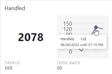
Look Back Chart |
|
💡 This widget property can be combined with a → Trend indicator, or used standalone.
Look Back Chart with value axis. Detailed datapoints are shown on mouseover |
||||||||
Presence Activity |
|
Shows the MS Teams Presence Activity (Out of Office, Busy in a Call, etc.) if extended presence tracking is enabled for the tenant. → See widget Filters. |
||||||||
Presence State |
|
Narrows down Users the MS Teams Presence Status (Available, Away, BRB, Busy, DND, Offline, Unknown). → See widget Filters. |
||||||||
Primary KPIs |
|
Optional KPI to show on the left Y-Axis. Can either be:
Up to 4 Metrics of the same type can be shown (stacked). 🔍 Also see → “KPI” entry in this table for details on each available metric. |
||||||||
Priority |
|
Column showing the 🔎 Task Priority of incoming calls. Tasks are distributed in a Round-Robin method. 🔎Note “Strict” priority tasks take precedence while “None” priority may get starved by any other priority tasks. Visit the Task Priority page for more details. |
||||||||
Retries Left |
|
Limit the list of Outbound Call / Call On Behalf tasks that only match the remaining retries criteria. 💡 A retry is one attempt to distribute an outbound call to a user. If the Nimbus user (Agent) does not respond in time, this number is incremented up until a specified maximum. 🔍 Tasks retries are specified and manipulated via Flow Actions of the Microsoft Power Automate Connector. |
||||||||
Scale |
|
Text and Element scaling within the widget. 💡 Does not impact → width or → height of the widget itself. Overflow will result in scroll bars shown inside the widget. |
||||||||
Secondary KPIs |
|
Optional KPI to show on the right Y-Axis. Can either be:
Up to 4 Metrics of the same type can be shown (stacked). 🔍 Also see → KPI for details on each Metric. |
||||||||
States |
|
Determines the status of a task, as it used in other Nimbus UIs:
1🔍External / Outbound Tasks are created and manipulated via Flow Actions of the Nimbus Power Automate Connector. |
||||||||
Supervision Active |
|
Status indicator for when Supervision → Controls were used. 🔍 This column relates exclusively to Supervision widgets. Refer to Dashboard Supervision for details. |
||||||||
Thresholds |
|
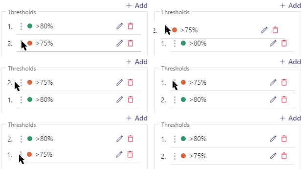
Applies an event threshold that reacts to a specified KPI (or column in tabular widgets). The threshold criteria are as follows:
|
||||||||
Time Frame / Scope |
|
Narrows down shown data by time:
💡 Used mainly for "historical" → KPI , e.g. Task that have concluded with a definite result. |
||||||||
Time in State |
|
Tracks the time (upwards counting) since the Service / User state has changed. Depending on the widget this column tracks different times:
💡 We recommend to combine this column with → Thresholds to mark entries that have exceeded a certain time limit. |
||||||||
Title |
|
Customizable widget title. Can be hidden for some widgets via "Show Title" Toggle. 💡 Dynamic KPI Title Placeholders: In widgets that show a single KPI the title can include a <KPI name placeholder> and mixed with your text. |
||||||||
URL (external website) |
|
Used to specify an embedded website. The URL must start with https:// Insecure websites are not allowed. Website embedding limitations apply. Learn more on the → Limitations chapter below. |
||||||||
Trend Indicator |
|
Total Task trend with inverted positive (red color) setting |
||||||||
Type (of widget Filter) |
|
The type of service (inbound / outbound). 💡 Depending on the widget this filter may be limited to a preselection. |
||||||||
|
Determines what type of User States the widget should display.
💡 Note that after selection additional filters to narrow down the states become available. |
|||||||||
|
All times are specified in hh:mm:ss
🔍 Note that RONA and ACW values can be adjusted via Distribution Service Settings for each Service. |
|||||||||
Width |
|
Determines grid tiles used by this widget. 💡 widgets may snap back to certain min / max grid sizes depending on widget type, e.g. to allow a minimum of content being shown. 💡 While in "Edit mode" you can also adjust the widget width via the handles on the widget's bottom-right corner.
|
Limitations
INC Dashboard Widget Data Size Limitations
☝FILTER/QUERY SIZE LIMITATIONS
To keep the performance on Dashboards manageable, query limits of 200 users / 200 services each apply on filtering (e.g. when selecting very large Organization Units). This limit applies summed-up across all widgets on the same Dashboard.
💡A warning and counters will be shown when this limit is exceeded and data will not be queried.
💡(Existing) Dashboards that break this limit will not be adjusted retroactively, but also show the warning instead of the actual data query.
INC Website Embed Limitations
WEBSITE EMBEDDING LIMITATIONS
Some websites prevent IFrame embeds on remote sites, which cannot be circumvented. When you try to embed such protected URLs, errors like 401 (unauthorized) or a "Refused to Connect" message will be shown instead of your desired output.
✅ Possible Workarounds:
- If available, consult your external source website support to check if any iframe-referrals are allowed. Some services offer specialized data widgets for that purpose or provide authorized token-URLs that you can use.
- If you have access to whitelists on your source website, try to allow the *.luware.cloud domain for external embedding / referencing.
Show more technical information...
There are two types of HTTP headers in websites that control iframe loading:
X-Frame-Options: DENY
Content-Security-Policy: frame-ancestors 'none'
The HTTP Content-Security-Policy specifies valid parents that may embed a page using <frame>, <iframe>, <object>, or <embed>.
A website header called x-frame-options specifies the access prevention, determined via the following values:
- if set to DENY the site isn't allowed to be loaded in iframe
- if set to SAMEORIGIN the page can only be embedded in a frame on a page with the same origin as itself.
- if set to ALLOW-FROM the page can only be displayed in a frame on the specified origin. This only works in browsers that support this header.
🔍 Related Sources:
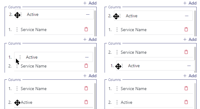 Determines which columns get shown in a tabular widget.




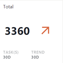 💡 This widget can be combined with a → Look Back Chart, or used standalone.
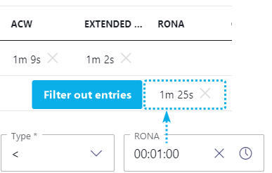 Allows to filter entries by inequality operators " >, >=, <, =<" for: